
This case study was completed while I was a student at DigitalCrafts for UX Design. The project's purpose was to make improvements through user research, and usability evaluations. Also, uncover the problem areas and create a mock-up of a possible solution.
View Prototype
We chose a music app to research and evaluate. We looked at apps and decided on Spotify! We had not used Spotify before this kept us from being biased. We then conducted research, looked at the competitors, and interviewed individuals to gain knowledge on the existing application.
Timeline and Tools: 7 days, Figma, Miro, Zoom for interviewing and testing
Application Research before Interviews
I started off my research with an analysis of Spotify's competitors - Pandora, Soundcloud, and YouTube Music. I compared these features in the snapshots below.


Click here for full Critical Feature Analysis document
We also completed a Heuristic Evaluation. This is used to evaluate the usability of a site based on a set of principles.
Click here for the full Heuristic Evaluation document
Findings:
Spotify was overall a user friendly application but a bit busy/cluttered that we could tell from doing these first two pieces of research.
The Problem Statement 1:
I found that the Spotify app feels busy/cluttered. This is apparent when using competitors' apps. I noticed that small but significant changes could be made to enhance the music listening experience.
How might we tidy up the app and the overall experience?
I conducted eight interviews to find out more about the user trends, the potential problem areas, and the likes and dislikes. Below is what we found out through affinity mapping presented on a Miro board.

I had a good demographic range of fifteen to forty-five years old, with male and female participants. What did we discover from doing these interviews?
Insights
- IPhone users
- Ease of use VERY important
- Likes playlists
- Paid user
- Doesn't like CarMODE
- App overwhelming
- CAR
- Offline content
- 3 to 5 times a week
- User for 7 years avg.
Based on the takeaways from my research. I created the ideal persona, Samantha. Her behaviors, likes, motivations, and frustrations reflect the users I interviewed.

I needed to do some research on how individuals move through the app. Th testing was done on the original app. I gave six individuals two different tasks to complete.
Task 1: Genre exploration and ease of navigation
User Task: There is a subgenre of Reggae called “Soca”. Find the playlist “Carnival” featuring DJ Private Ryan.
6/6 USERS FOUND THE PLAYLIST ACCORDING TO THE TASK.
1/6 scrolled down through the Genre “cards”, the others utilized the
search bar instantly. The one user who scrolled through the cards ultimately scrolled back up and began using the Search bar.
ANALYSIS
Most users didn’t scroll down into the genres, but went straight to the Search bar, and looked up the artist, “DJ Private Ryan”. Then began scanning images for a playlist-specific name. It’s interesting that only one user scrolled down the page through the various genres. No users tried searching for and filtering by “Genres & Moods”.
RECOMMENDATION
To highlight and/or put an emphasis on genre usability as you currently have to scroll through 60+ genre cards.
"Searching is much quicker than scrolling down through all the genres"


Task 2: Finding a specific playlist.
User Task: A friend recommended this playlist. Find it.
4 /6 USERS
The users were able to complete the task. Of the users that abandoned, it is noted that they:
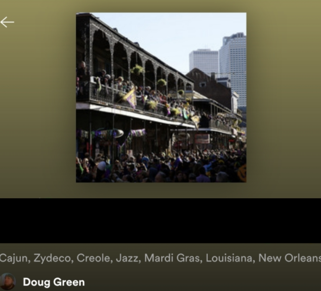
Unsuccessfully attempted to access the entirety of Doug Green’s playlists. Were unable to filter playlist results within Doug Green’s playlists. Abandoned on the Doug Green Playlists Page.
ANALYSIS
While the majority of users were successful in completing the task, it could have been far easier. Users were scrolling the limited playlists page trying to match album art. Furthermore, users spent on average 3.54 minutes before being able to find the playlist (if at all).
RECOMMENDATION
Consider adding search functionality to playlists and/or offer complete access to a profile’s playlists "I can’t access all of the playlists and I can’t search either".
The Problem Statement 2:
Users confirmed the app was busy/cluttered, specifically with how genres are presented. The overwhelming amount of clickable and explorable options leads some users to abandon app exploration and utilize their own playlists.
How might we construct a middle ground that encourages users to find new music and easily create playlists?
At this stage, we were tasked to create prototypes starting from the low fidelity and work our way up to mockups. Below I will show some mid-fidelity prototyping and show my process.
Idea 1:
Chose to redesign the profile page. We decide to highlight the following designs; the company logo, metrics, search function, and reorganization on the app page.
Highlighted Items
1. From the original app, the recently played artist are listed first. I changed this to show the profiles playlist first. If you get to a profile this is what you are looking for.
2. The company logo, was taken off in the design of the mid-fi to the prototype.
3. Added a search function within the playlist and the recently played artist, this is currently not on the app.
4. For the metrics, an hours listened was added


Idea 2:
Chose to redesign the genres page. We decide to highlight the following in the designs; Genres & Moods Nav Bar, customizable genres and moods area, an explore area, playlist button in the now playing bar.
Highlighted Items:
1. Added a new "Genres & Moods" area + icon in the Navigation bar - The icon was taken off in the final version. The Mid-Fi was also changed when the final version was submitted
2. Customizable "Your Genres & Moods" area - This area is customizable to the user's likes
3. Browse all has changed to "Explore" - This area was implemented to have a tiered genre and playlist hierarchy. This was all changed in the final submitted version.
4. Add to playlists button in the Now Playing mini bar - This enables a quicker playlist functionality.


Ideation 3:
I chose to rework the Search page of the app. During the testing I noticed users having to scroll through numerous genres to get to where they actually needed. I wanted to simplify this action so, I started this process by doing some drawings. I used a method called Crazy 8's. This help generates ideas and where to possibly start. I picked the low fidelity below to start my design process.
Sketches:
Thoughts for the new design:
1. I decided to add a tab bar under the search bar area.
2. The Tab bar includes; Genres, Albums, Artists, and Playlists.
3. Decided to simplify the scrolling of the current application.
4. I decided to have five main options and a See More button. The five main options will generate as you use the app.

After doing the Crazy's 8's and finding a good low fidelity I liked to build from. I moved forward and started working in Figma to create my mid-fidelity designs. This part was when I started seeing the design come alive and it got really fun. I started with just grey blocks and eventually added text in blocks to see how it was coming together.
Low Fidelity & Mid Fidelity


Mockups


Prototype Visualization
After making all the changes to the mock-ups, I updated the prototype in Figma. Check out the prototype below.
Please CLICK HERE to view and click around on the built prototype.
We found that the heuristic score of one was higher than it should have been. We found that users struggled more than we gave the app credit. I Learned that we need to give specific tasks that cater to all users on a platform we are researching. We also needed to address information if we are going to not continue to use it so individuals or stakeholders don’t get lost in the process. Addressing the Search page and creating some new features that simplify the app and did away with the endless scrolling of genres on the Search page.