
This case study was completed while I was a student at DigitalCrafts for a UX Design Bootcamp. The purpose of this project was to create an app that is new to the market through brainstorming, research, design, and testing. Then create the prototype.

The team consisted of the five students in my class. We wanted to develop a research-based solution to help organize and help complete tasks and habits with motivation through gamification.
Timeline and Tools: 3-week spirit, Figma, Miro, Canva for presentation, Zoom for interviewing, and UXtweak for testing
Research
Competitive Market Analysis
We first spent time looking at the apps that were on the market. We then found five apps that we thoroughly looked into the details. The apps we looked at were LifeUp, MinimaList, Habitica, Habitify, and The Fabulous. After looking into each app we found that we were able to create a non-RPG, gamified, productivity app. This is what we were wanting to create!

User Research
Surveys
We created a survey to see how users would do tasks and habits in their day-to-day lives. We also wanted to find out what their motivations were, and areas they may struggle in when completing tasks or habits. Some of the key insights we found during this process were as follows.
1) People wanted a personalization and to not be forced into certain tasks.
2) Most people used their method of task/habit tracking multiple times a day.
3) People were unable to find a way for habit building to be fun and with consistent accountability.
4) People were motivated in a variety of ways, one size fits all won't work.
Psychology Research
We looked at some topics that would help us in understanding and develop the app we wanted to create. We looked at six different topics. The topics we researched more are as follows.
1) General App Development
2) Gamification Psychology
3) Behaviorism
4) How to Build Better Habits
5) Psychology of Motivation
6) Reminders and Notification Psychology
My main focus of research here was the Psychology of Motivation. Here I looked into Maslow's Hierarchy of needs. The needs at the bottom of the pyramid must be satisfied first in order to move up to satisfy the next tier. From the bottom up we have the basic needs, the psychological needs, and the self-fulfillment needs. These definitely played a role in this app.
Going even deeper into the pyramid I looked at deficiency needs and growth needs. The deficiency needs consist of the bottom four tiers, and the growth needs consist of just the top tier. Deficiency needs decrease as needs are met. The motivation to fulfill these needs will get stronger until these needs are met. With that said when these deficiency needs get met, they tend to become habitual. Looking at the top tier, growth needs are not from a lack of something but they are from a person having a desire to grow. Everyone has the desire to grow but this is interrupted by the failure to meet the bottom four tiers.
User Interviews
We conducted interviews to find out more about user trends, potential problem areas, and likes and dislikes. Below is what we found out through affinity mapping presented on a Miro board below.
Insights from interviews are:
1) Internal factors were valued more than external for motivation.
2) Biggest internal factors were, "I want to do it", lifestyle, or self-worth.
3) Most use a paper checklist - writing a list and seeing what you've accomplished checked off.
4) Most said they know others around them that also struggle with keeping on top of tasks/habits and might be willing to refer the app to family & friends.
5) People like micro-interactions, including visual, sound, and haptic feedback.
Persona
From the interviews, and affinity mapping we pulled some insights like common motivations, goals, and frustrations we created Jade.

Current Task Analysis
The task analysis below shows how users currently keep track of tasks and habits. This helped us look at areas that could be improved as well as the abandonment of tasks.

Problem Statement
People feel a strong sense of accomplishment and happiness when they are able to successfully complete their to-do lists. While people are able to achieve the documentation of their objectives, they still have trouble following through to completion. Many people need help establishing methods to stay motivated and organized in order to reduce the abandonment of tasks, habits, and goals.
How might we create a solution to motivate the development of habits and the completion of tasks while simulating the satisfaction of physical lists to assist people in achieving their goals?
Value Innovation Storyboard

Ideation
We did some sketching to get ideas of how to start making the app look. We then did some dot voting to keep certain ideas in the theme of the app.


Below are the main items we came up with to have within the app. This helped as we started the process of wireframing.
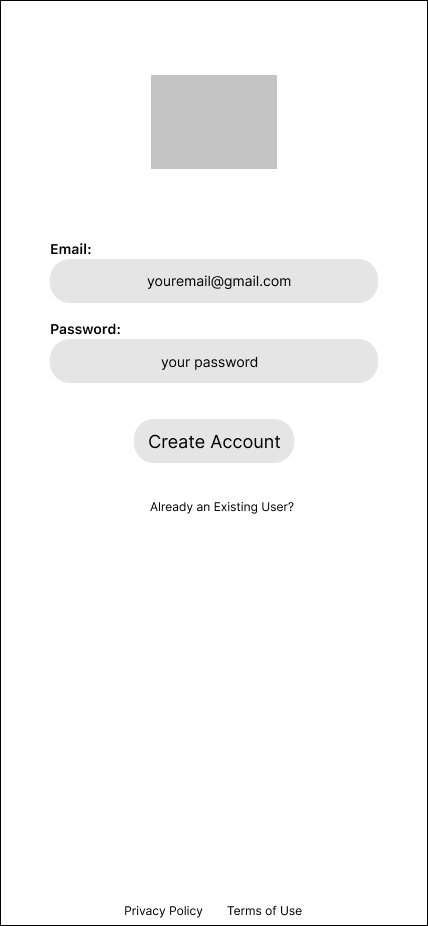
Login / Sign up Page
Onboarding / Welcome
Get to know the user questions
Tutorial
Guide Quiz
Homepage / dashboard
Rewards and competition pages
Profile
Calendar
Week View / List View
Daily View
Add a task / habit
Micro interaction when checking off
Path progression as you complete tasks
Wireframing
After sketching we started wireframing. We started with low fidelity screens in case we wanted to change the design.
First I thought about the New Users. These are shown below.


Next was to create screens for the Returning Users. These are shown below.


After creating an account as a new user you are then directed to pairing you with a Guide. From here we ask you a series of questions to select who will be best for you individually.


After answering the last question you are then paired with the correct Guide for you at the moment. We also decided that you should be able to change your Guide as you progress in your tasks and habits. We created four different coaches to help people's personalities. We have the Optimist, the Assertor, the Challenger, and the Naysayer.


User Testing for Onboarding
Results from onboarding testing are below. We asked for three tasks from the testers. We also found that we need to open the areas that are clickable to lessen the misclick rate(shown below).
T1: Create a new account
Grade: Low Issue
Analysis: Straight forward process for the testers. A Small amount of time spent on each screen(avg 2.2s) in this task flow, indicates an intuitive flow to create a new account.
T2: Navigate to Home screen/dash
Grade: Medium Issue
Analysis: This task had a high bounce rate(25%), indicating frustration for our testers. Ultimately, the correct path required clicking through the “Guide” quiz to land on the Dashboard. Results showed users trying to find the dashboard without having to click through the quiz. In the future, we could change the task title OR, provide an alternate path to land at the dashboard.
T3: As a returning user, log in to app
Grade: Low Issue
Analysis: Another straightforward result for the testers. Avg time of 1s spent on each screen, and a very low 4.3% misclick rate shows.


User Testing for Dashboard Screens

Results for Dashboard Screens
Results from the Dashboard screen testing are below. We asked for three tasks from the testers. Again find misclick rates high and need to change the clickable area for users.
T1: Complete 1 task for today
Grade: Low Issue
Analysis: An 85% success rate reveals overall successful design in the “Complete a task” flow. While there was a 27.7% misclick rate, some of that can be attributed to the number of clickable elements on these screens. Coupled with a 0% bounce rate this task scores as a LOW issue.
T2: How would you add friends to compete with?
Grade: High (wrong word?) Issue
Analysis: This task caused confusion for the testers. With a low success rate of 28.6% and looking over the physical click locations, it’s clear that the trophy in the Nav Bar didn’t lead to finding “Competition” related content. Competition Mode with Friends will be a V2 feature... I don’t love my phrasing here, obvs feel free to edit.
T3: Where could you turn off the motivational msgs from the coach?
Grade: Low Issue
Analysis: With an 84.6% success rate and avg of 4s per screen, the testers found the slider option to deactivate motivational messages quite easily. Nested on the Profile page with other On/Off settings, this task revealed intuitive placement for customizable settings.


User Flow
This shows the ideal path through the app, with a path for new and returning users. It also provides a visual guide for future iterations, helps finds mistakes in the prototype, and find gaps in the flow so that the user is not confused inside the app.

Branding
When we created this idea the name was still up in the air undecided. Then one day a team member said Shadoo, like a fun play-off of "Should Do". We also played off of the "S" when creating a path within the app.

Future State Journey Map
This map shows the user journey and can be used to find gaps to improve future iterations and to enhance the user experience.

Outcome & Lessoned Learned
Top priority: usability testing on the V1 prototype which includes testing the screens and flow of the tutorial, onboarding, and dashboard areas. Plus, we'll continue validating our product concept to be sure what we built is wanted by and would be used by users. During that testing, we would also gather insights on which of the following features to prioritize for V2 and beyond:
- Build out competition mode
- Explore premium
(cost, change Guide clothes)
- Invite my friends to compete
- On screen timer attached to some
tasks / habits
- Horizontal month view
(bullet journaling to show progress)
- Difference between work and personal tasks
- Delete or trash can option
- Build out what notifications look like
- iPhone system for sharing
- Sharing tasks that once completed,
both get an interaction / emoji
- Build up library of pre-planned
habits for quick add
- Widget integration
